Funes


Book Update #5


Chip Kidd
The artists that appeal to me the most are the ones who use their knowledge of a particular medium to it’s potential without be excessive or haphazardly experimental. I chose to write about Chip Kidd because all of his work is concise and has strong visual clarity. Each element that is placed on his canvas contributes to the message he is trying to convey and has a simplistic beauty. A common problem that I find among artists is that their lack of understanding of their craft usually leads them to add elements that do not belong or are placed without meaning. Now, there is nothing wrong with being experimental, but I feel that a solid foundation on design must first be acquired before rules can be bent.
Altered Book


Saul Bass
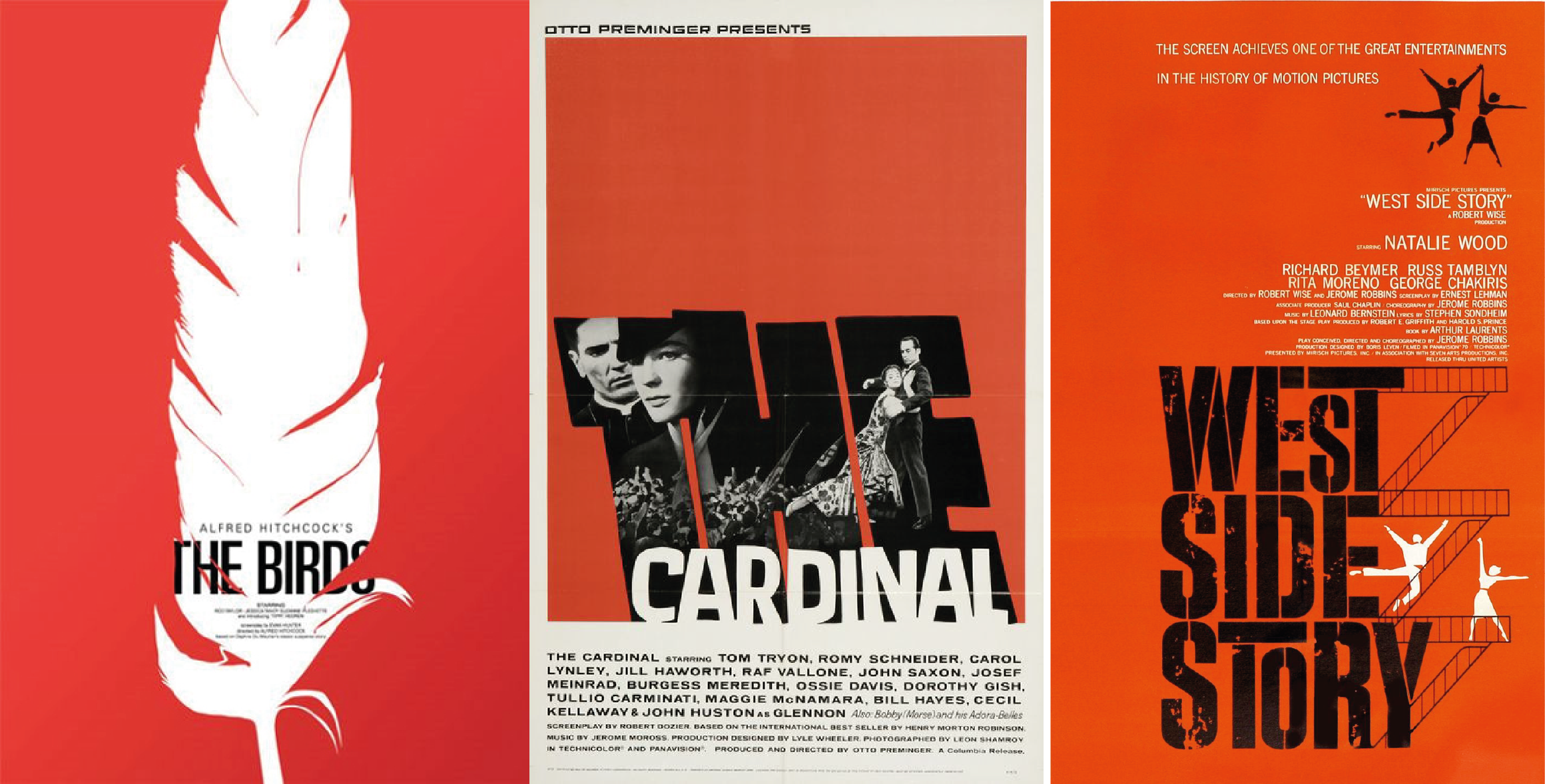
Saul Bass is a graphic designer that caught my interest because of his work in the film industry. He has designed an abundance of wonderfully crafted posters that, in my opinion, are far superior to the posters that are produced today. There is an elegant simplicity to his posters that provide intrigue without any major spoilers. His art work is almost minimalist, but is deceptively intricate. Each piece of work he’s done, clearly shows that a lot of thought was put in to provide maximum impact with the least amount of detail. His use of text in combination with simplistic imagery is unique in that, he’s utilizing composition and abstract symbolism to garner interest rather than shoving as much content as possible within the frame. His philosophy behind his art is pretty much a representation of how I go about my own projects, I believe that less is more in most cases.
EDIT: This is probably the artist that I’m most grateful for discovering. His work pretty much embodies everything that I do as an artist in terms of form and content. I’ve always been a believer that less is more and Bass’s concentrated vision in his artwork is actually the definition of what I consider to be quality. If a project is less cluttered, the audience is then allowed to focus on what is truly important, and it also gives the creator time to channel all efforts towards a particular area, thus making something that is more polished and refined. Discovering this artist was probably the most important event in this semester because it allowed me to gain profound inspiration from art that was created in an entirely different medium than my own.

Book Update #4


Book Update #3

Book update #2
Here’s a couple more pages from the book. I’m still working on the introductory section so there’s a good bit of writing. The later pages will be more picture heavy.


Su Blackwell
Her work really stands out to me personally because she doesn’t just create abstractions out of altered books like most artists, she creates scenes that are recognizable and very tangible. Her work reminds me of the set design you would find in a musical/play, the book is the stage and and the props on top are the set design. Her eye for lighting is also very impressive, each shot is dramatically back-lit and is perfectly tuned to draw your attention towards the subject. Just fantastic work all around.

